
Buttons
Overview
Buttons are interactive elements that trigger actions within the interface, but do not navigate a user to another page. They establish visual hierarchy through style and emphasis, helping users understand which actions are primary versus secondary.
Each screen should, when possible, feature a single prominent button for the primary action. Supporting actions should use lower-emphasis button styles. Use consistent color, placement, and hierarchy to guide user attention and reduce confusion.
There are five button types in Beacon UI:
- Primary
- Secondary
- Link
- Success
- Danger
Guidelines
Dos
- Use the Primary button for the most important action on a page (e.g., Edit, Update, Run Report).
- Use Secondary buttons for less prominent or cancel/close actions.
- Use Success buttons for creating, committing, or completing workflows.
- Use Danger buttons for permanent deletions or irreversible actions.
- Use color and contrast to clearly communicate button hierarchy.
- Use the
<button>tag for actions performed within the page. - Use the
<a>tag for navigation between pages or routes.
Don’ts
- Don’t use more than one Primary button per view or modal.
- Don’t use a Danger button for non-destructive actions.
- Don’t rely on color alone to indicate button purpose—include clear labels.
- Don’t make Link buttons look identical to primary or secondary buttons.
- Don’t use buttons for purely decorative or static content.
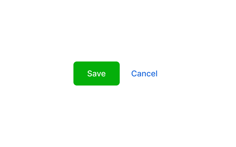
Do
When accompanied by another action (e.g., Cancel) primary buttons are always placed to the left. 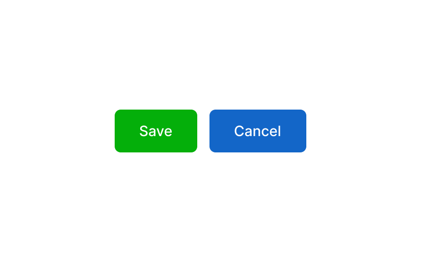
Don't
When in close proximity, never use the same button style for both primary and secondary actions. 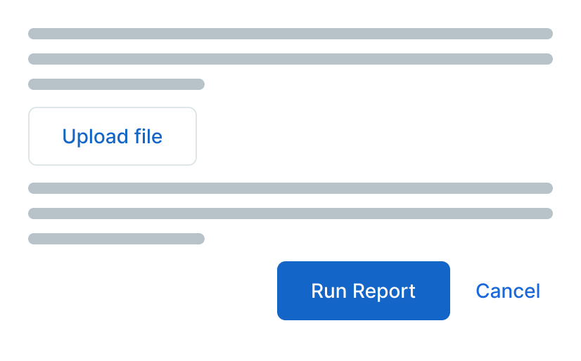
Do
There should be a single, Primary button, for the most important action on a page. 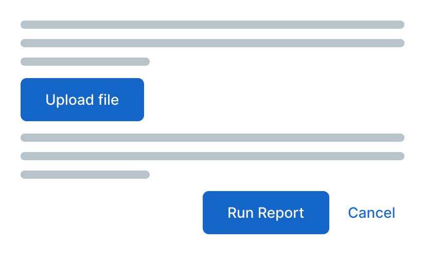
Don't
Do not use Primary button styles for performing secondary actions on a page. Variants
| Variant | Description | Example Use |
|---|---|---|
| Primary | High-emphasis button for key actions | Edit, Run Report, Open Modal |
| Secondary | Low-emphasis button for secondary actions | Cancel, Close, Dropdowns, Alternate Options |
| Success | Positive actions for creating or persisting | Add, Commit, Complete Workflow, Save |
| Link | Text-only button for inline or contextual actions, creates a larger click area than a regular link would | Single icons |
| Danger | Destructive or irreversible actions | Delete, Remove, Permanently Archive |
Modifiers
Modifiers define how buttons adapt to different interface contexts or containers.
- Use
btn-smfor compact interfaces (e.g., within panel headers or table toolbars). - Use
btn-blockwhen the button should span the full container width. - Use
btn-roundmainly for smaller icon-only buttons.
Related Components
Button Group — Styled radio group.
Dropdown Button — Menu-based action sets.
Link
Primary
Secondary
Success
Danger
Button Container
For use with multiple buttons aligned horizontally. Responsively stacks the buttons at the xs breakpont.
No Wrap
Add btn-container-nowrap to keep the buttons on a single line instead of wrapping when space is tight.